Summer is here, and I’m looking forward to all the opportunities to get out of the office. We have vacations planned, the kids will be going to camp and playing sports, and I’m also fielding record numbers of client inquiries. It’s very exciting to see people coming out of the COVID shell and looking forward to entertaining in their homes.
This episode, I answer questions about…
[5:53] What to do with a chair rail in the hallway of a mid-century modern home (Ranae – Atlanta, GA)
Question:
I have a chair rail in my hallway. Is this weird? Should we take it down? Our house is trying to be comfortable, mid-century modern. The architecture is a mix of modern and traditional ranch.
Answer:
I recently worked on a colonial home, built in the sixties. They had a chair rail all through the hallway as well as up the stairs, and they were asking me the same question. We have to consider whether or not the chair rail is doing anything for us. As far as design, is it adding visual interest? If you are just planning to treat the area below the chair rail the same as the area above it, I would advise you to get rid of it. A chair rail is a piece of trim. If you are going to use the same paint or wallpaper above and below it, it isn’t really serving a purpose.
It could, however, help an area stylistically. For instance, in the space I designed in Westchester, the hallway and the stairway were pretty architecturally neutral. There were no windows, the light fixtures were simple, and the ceilings weren’t high. There was nothing really visually interesting about those areas, so I decided to keep the chair rail. We are doing a slate blue below the chair rail and a mid-tone gray above it. It ties in beautifully with the rug and the tones of the pieces that I’ve selected for the living room.
Whenever I have a chair rail, whether it’s a dining room or in this case a hallway, I like to do the heavier thing at the bottom and the lighter thing at the top. For example, the slate blue is visually heavier and darker, so it goes below the chair rail. The mid-tone gray is a lighter color, so it goes above the chair rail.
A lot of people, especially in a dining room, put wallpaper above the chair rail and paint below it. I often do that myself in spaces that are more traditional. When I do that, I make sure that the wallpaper feels lighter and I use something weighty at the bottom.
[13:18] Considerations when choosing a timeless kitchen backsplash (Ranae – Atlanta, GA)
Question:
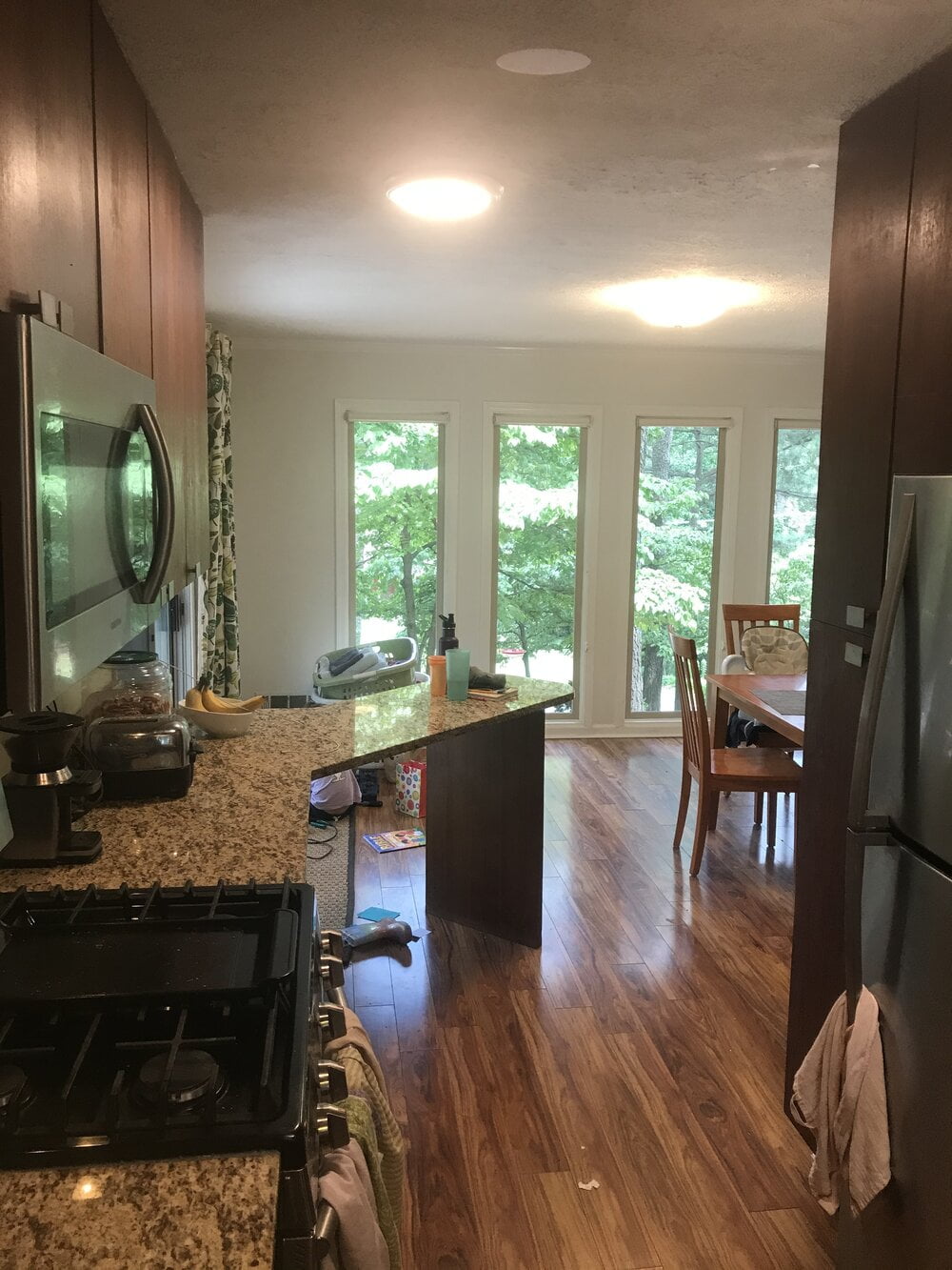
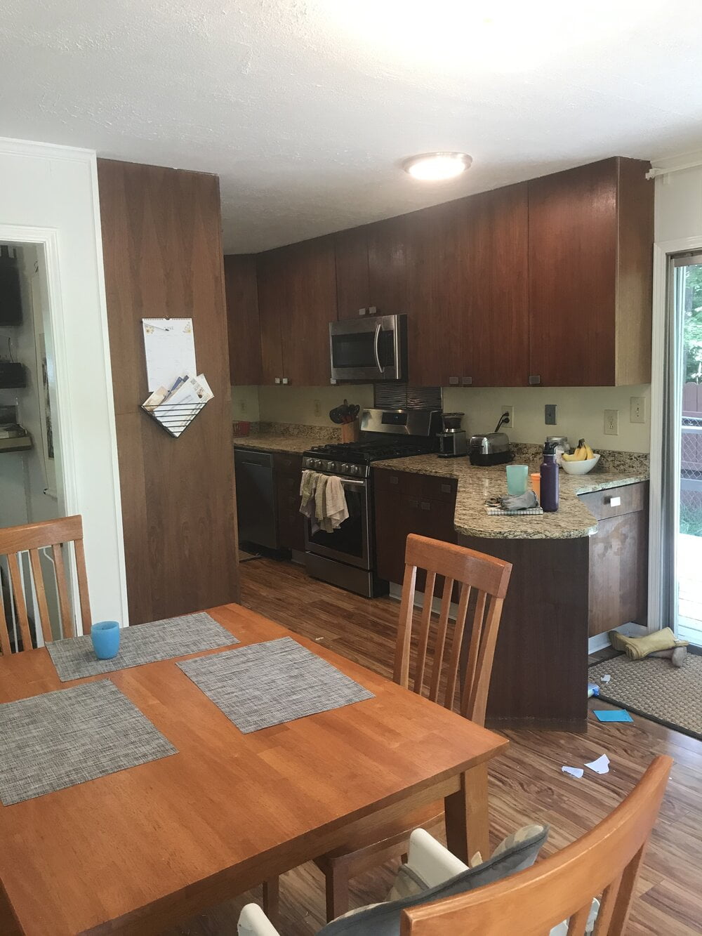
What would you do for our kitchen backsplash? I was thinking a greige subway tile, but I’ve heard you say subway tile might soon go out of style.
Here’s the backstory: We’d like to freshen up the kitchen, but we do not have $20,000 for the redo. When we moved in, our dining area was carpeted and our family room was lined with dark wood paneling. We painted the paneling, we ripped out the carpet, and we updated the appliances from the original 1970 avocado green electric microwave oven cooking center, which is why the area behind the stove is a different backsplash material.
Our backsplash is currently a yellowed, off-white formica. We do hope to get rid of the little island area and of the countertops so we can fit in a bigger dining table that will hopefully not be wood grain.
Answer:
It is a bit dark in your kitchen, especially as it opens to the dining area that has beautiful almost floor to ceiling windows and plenty of light. I can understand why you would want to lighten up your kitchen a bit, and I do think a backsplash would be a great way to do it. I definitely wouldn’t do a pure gray or anything too blue or cold, because you want to pull one of the tones from the countertop for the tile.
To be honest, I feel like subway tile is an uninspired choice. People use it too much. It’s classic and does not go out of style, but I would never personally use it in my own space unless I laid it a new way to make it more visually interesting. I might try a chevron pattern or use an elongated subway tile to do something other than the default.
I know it’s affordable, easy to find, and palatable to most people, but are those really reasons to choose it?
One thing I see with your backsplash is that your countertop goes up, maybe 3-4 inches on that wall. Whenever I have a backsplash that is much smaller than the typical surface area, I will do a tile that’s a little bit smaller as well. Scale to the space. When I have a large wall for a backsplash or I’m going to take that tile all the way up the wall, I will go for a mid-size or larger tile to really add drama.
Here are some ideas to keep in mind as you’re choosing your tile. Your kitchen has a lot of brown on brown or brown on beige, so this might be a fun place to add a pop of color. Brown is considered a warm color, and so I would like to cool down all of this brown by incorporating a cool color. Purple is a cool color, but it’s not very popular. Unless you’re planning to be in the home for 15 years and you don’t care about resale value, I would avoid purple. I would definitely consider, however, doing a blue or a green tile. I think that would really add visual interest, make it look like you made a strong choice, and cool down this warm kitchen.
Also, I completely agree that you should not do a wood dining table. It’s “woodmania” in that room, and the more you can layer in other materials that are not wood, the better. You could use a rug, drapes, artwork – anything to distract from all the brown will really be a breath of fresh air.
[19:57] Cloud tiling in a powder room: sophisticated or silly? (Beth – Colorado)
Question:
I have a question related to bold powder rooms. My family lives in a barn-shaped farmhouse in Colorado. Our neighborhood is an air park. The HOA maintains a shared runway for small airplanes, and many of the homes have huge airplane hangars. We have 5 young kids. Finally, everyone is potty trained. It’s time to redesign our powder room. Our style is lively, industrial, and we balance out starker woods and metals with natural colors – creamy white, mountain blue, denim blue, leaning toward gray and leafy green. We also have some pops of cherry red at Christmas and on patriotic holidays.
We love flying. We’ve used our industrial style to work in about four aviation themed items into our main floor as celebrations of flight for us and our guests. So far, the boldest design move I’ve made is a wing-shaped coffee table. This has been a delightful addition to our family life, but I need you to smack me down if I’m taking it too far with this powder room idea.
My powder room is small. It has no windows, but it does have a high ceiling. We haven’t purchased anything for the space and we’re on the hunt for something lively, industrial, like a riveted mirror frame, or the remnants of an airfield lamp to use as a light fixture. We want to use that as our inspiration for the space before filling in everything.
We can across this 4 in. x 5 in. ocean glass tile. One is a stormy blue/gray, and the other is a creamy white. It reminds me of some curvy kitchen tiles I’ve seen lately, but instead of a fan or lantern shape, these are shaped like clouds.
I’ve heard that powder rooms are a great place to go bold, but is that good advice for design novices? Tiling is pretty cumbersome and I’m not easily corrected if I go wrong. Do I need a smackdown? Bottom line is, could cloud tiling be sophisticated or is it just silly? And if you would give it the green light, then how much is too much? Should we be thinking of tiling the floor to the ceiling or some smaller portion being a better decision? We want our home to be lively, but not ridiculous. If you were working with this tile in a powder room, how would you provide balance in the remaining design choices so that the overall style stays sophisticated and lively?
Answer:
First of all, I love the idea of your family living near the mountains and going flying, hearing planes, and really embracing your hobbies so close to your home. That is so inspiring.
Typically in a powder room, because there is not a tub or a shower, I would not tile the walls. As I shared in my answer for Ranae previously, you need to consider scaling to the space as well. You mentioned this powder room has higher than normal ceilings, and a 4 in. x 5 in. tile is not all that big. It’s a small to medium tile, and I’m worried that if you put this tile on all the walls and go all the way up to that extra height, it’s going to be dizzying.
I do like the idea of using tile on the floor, but this tile looks like billowing clouds. It’s asymmetrical and it is directional. So if I was laying this, I would lay it on a wall and not a floor because it definitely needs to go up.
I have arabesque tiles, which are more symmetrical. They are the same on the top as on the bottom, as well as side to side. I could lay those on the floor or I could lay those on the wall vertically. This cloud tile is not symmetrical, so it needs to crawl the walls and not lay flat on the floor. I do not want you taking this tile all the way up. You could consider adding a chair rail, but I would be more inclined to do a whimsical wallpaper rather than tile for this powder room.
It seems kind of like a beach house, where it’s fun to play with multiple elements that reference the water. You are in an airplane house near a hangar and a runway, so it makes sense to embrace that with a few more elements than I would typically use. I may avoid, however, doing that in something structural like tile that is very hard to change out and could deeply impact resale value.
I would do a more basic tile on the floor and think about being playful with wallpaper, because nobody is going to want your wallpaper no matter what you choose. I might also have some fun with a fixture that hangs down from the high ceiling. Especially in a room as small as a powder room, I would keep the aviation theme to only one element. It could be a light fixture, the wallpaper, or a piece of art, but it’s just too small a space to be too over the top and still keep some level of sophistication.
Links:
Website:
Book:
https://www.betsyhelmuth.com/my-book
Become a Premium Member:
https://affordableinteriordesign.com/podcast
Submit Your Questions:
https://affordableinteriordesign.com/podcast
Instagram:
https://www.instagram.com/affordableinteriordesign
Facebook: